Materials, Techniques and Processes Analysis Sheets
Material/Technique/Process name: Pencil
Variation or types i.e. 2B 2H pencil or shape/motion tweening:
There are variety that are available from colouring pencils, graphite, mechanical pencils and a range of H to B pencils useful for shading as well. There’s different forms of pencils made for different kinds of uses e.g. writing, sketching etc.
How do you use the material/Step by step instructions for techniques or process?
With a pencil you are able to create curves and lines, depending on the direction of where you drag the tip of the pencil at. You can even change shade and tone by the amount of pressure you put the pencil tip on the paper. The harder the pressure, the darker the shading will be. You can also use different shades of pencils for different effects.
Relevant dimensions or constraints:
- Light-Weight
- Hexagon
- Thin
- Sharp
- Stick
Linked Techniques:
There are techniques with a pencil which you can create results in sketches and artwork. You can try to shade from light to dark by increasing pressure when you’re shading bit by bit. It won’t look completely blended from my experience, but it’s useful for adding realism to a sketch. If you want your sketch to have a smoother appearance, you can smudge (with your finger) the shading done on the paper to blend in the pencil markings on the paper. You can also cross-hatch. The more lines cross over, the darker the area.
Health and Safety issues related to Material, Technique or Process:
Although graphite is used for pencil nowadays, lead poisoning had been a common problem when pencil contained lead. A pencil is capable of puncturing a person’s skin if it is sharpened enough.
Evaluation (How you found exploring each Material, Technique or Process): Using a pencil for creating sketching and writing has it’s ups and downs. You can change the tone and shadows from the amount of pressure you use on the pencil and you can erase your mistakes that you make on the paper since graphite doesn’t seem to permanently stain your paper that you may have drawn/written on.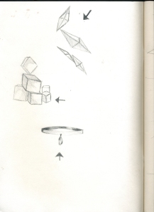
From the beginning of Unit 2, the tutor wanted us to practice shading from light to dark. So we drew any objects that we wanted in different positions and directions of light. I chose different shading techniques such as hatching, cross-hatching, blocked-shading and smudging to fill in areas and create shadows to cause a 3D look for these sketches. I even tried experimenting with the direction of light for each drawing I had done.
Material/Technique/Process name: Pen Variations or Types i.e. 2B 2H pencil or shape tweening: You have different forms of pens to use from fountain pens, felt tip pens, marker pens, prisma coloured marker pens and Biro pens (my personal favourite). Each pen have their own effect and texture when they are being used. How do you use the Material/Step by step instructions for techniques or process? You can use the pen to write/draw by creating lines and curves. All you have to do is press and drag across to create either a straight or curved line, depending on the direction you drag the pen. Relevant dimensions or constraints:
- Hexagon Prism joined to a Hexagonal cone
- Transparent
Linked Techniques:
Since using a pen doesn’t change tone in its’ strokes, you can find different techniques with using pen to make light to dark shading. You can do other techniques such as regular hatching, cross-hatching, pointillism (dotting) etc.
Health and Safety issues related to Material, Technique or Process:
It’s better not to draw on your hand as the ink of the pen can sink into your bloodstream and can poison your blood of done too often.
Evaluation (How you found exploring each Material, Technique or Process):
I can say that drawing with pen is much more enjoyable than drawing with pencil. Even though I can’t erase my mistakes from the sheet, I have learned to work around them and make something new, something better. I honestly think that this helps me to learn from my mistakes and improve my art into something better.
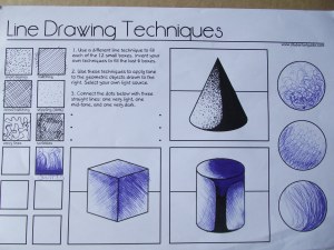 Using this sheet, I had to experiment with different sorts of line drawing techniques that is better to do using a pen. We had to think up of more techniques that you could use to shade in 3D objects. I tried techniques ranging from hatching, cell shading, dotting, scribbling etc. I took a break from how I normally shade and learned a bunch of new ways to create light and tone in my sketches.
Thumb-nail sketching and development
From one of the unit tasks, we were put into groups to create a modern, more attractive design for a website called ‘Poetry Slam’. We each had designed different sections for the website. Since this was just thumb-nail designing, we were told that we didn’t have to put a lot of detail into the layout we decided together. We did this for when we check through for any flaws/mistakes that we could have in our website design.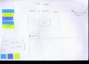
We had to think about what we would need to put into out website, what information would be needed or why we have it laid out the way we decided. We still kept the same layout design through all the thumb-nail sketches we created as a group.
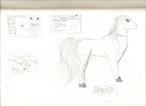 Soon, we had work independently on our own thumb-nail designs with the homepage we made as our guideline for how it can look. I made about four designs for the homepage for the Poetry Slam website. I procrastinated some of these thumb-nail, but developed them further later on.
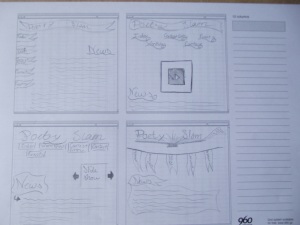
Afterwards, I had to make four new designs which have been developed from my four original thumb-nail designs that I designed. I did put more detail into these designs so that I could eventually come up with more ideas of what the page should look like. The 960 grid I had used measure up to 12 squares across.
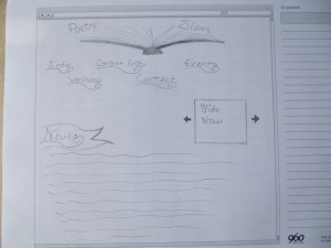 The final thumb-nail design was influenced from my third and forth previous thumb-nail designs. I had combined different design elements from each of them to be put together into this design.
Textures and Web Headings
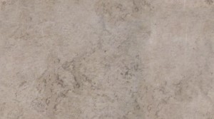
We created a seamless texture with this image from Deviant art by Angela Sasser, using photoshop eliminate any lines. This was done to practice making seamless textures so that in the future, I would be able to make better textures to put on for my final website design. The image below was the first seamless texture I managed to create with a tutorial and photoshop as well. I plenty of help from my tutor and support worker when I couldn’t really follow the instructions properly and felt a little confused on where I had gone wrong.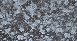
After completing or doing what I could do to make this image free from any noticeable lines, I had to take pictures on any other sites to find more potential textures to make seamless.
This was the first seamless that I made using an image I had taken a picture. This is a table texture taken from class that I used in photoshop. This texture didn’t have a lot of complicated details that the previous texture had, so I didn’t find it too difficult to render.
Wireframe Web Designing
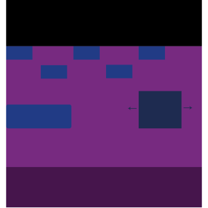
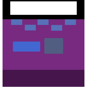
Using the 960 grid system and photoshop, I created a wireframe design of the Poetry Slam website. The design itself on Photoshop wasn’t finished when time had run out. I had not had a lot of experience with using Photoshop and so I had to learn along the way on using pixels for measurement, tools, brushes and layers to make each shape and to select different colours of my own choice for the page to contrast. I should of managed my time better so that the page may have been finished with more detail from my traditional sketch of my design for the Poetry Slam. I would honestly go back and change the colours used for the wireframe design. I think that the colours are too dark and wouldn’t contrast too well especially towards someone who is colourblind. I haven’t put in any text in the shapes I made. The alignment looked as if it was placed randomly rather than placed neatly.
After taking a look at the C.R.A.P. principle, I took in consideration at how I needed to change contrast and alignment of my homepage design. I changed some of the colours to a brighter shade that I originally used for my design, hoping that it should be easier for other people to see, even though I still kept some of the colours schemes from before. I didn’t manage to put text into the wireframe grid as I managed to screw up the text tool when I wanted to add labels onto the rectangles.
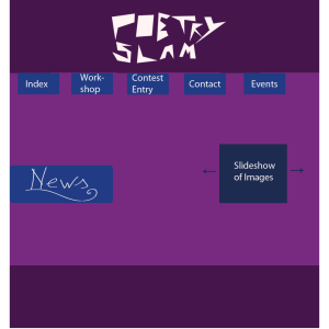
My (mock) Final Website homepage design for Poetry Slam
I had kept the second basic layout which I preferred in comparison to the second design I had made. However, I’m still not very pleased with this final design from the rather dull choice of colours that I had given to them as well as the dull appearance overall. It is an improvement from the first design I created. The alignment isn’t laid out well on the homepage. And the inconsistency of the text formatting that I had put on wouldn’t stick out well for the websites’ appearance.
This was another at creating the homepage after looking at the previous image through the C.R.A.P. principle to check on how I could change the homepage to be sure that it has contrasting colours, is repetitive in it’s layout, is well-aligned as well. I had lightened the colour scheme so that the text on the homepage would have better chance of standing out more. I decided that it would be good to add more details on the homepage unlike the previous attempt that I did.
Experimenting
To take a look at more resources and materials to mess around with and see what effect that it can have on artwork, I had taken a look at methods of creating art traditionally and digitally. I can often learn new skills from experimenting whether I enjoy the activity or not.
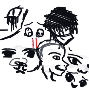
From the beginning, I had and used a combination of mouse and tablet-drawing to create different facial expressions and different eye shapes. I thought that I wouldn’t have needed to use any colours and styles from exploring faces I have seen anime/manga characters and from people in real life. This was all procrastinated (a habit that I have with most of my sketches), but the only difference between this and other sketches that I had made is that I have sketched this digitally rather than traditionally to get more experience and skill development. Sometimes, I have trouble drawing with a mouse and can have a lot more control using a tablet to create digital art. It was interesting to explore different expressions that display different emotions.

This was just what I had made in my time of boredom and procrastination when I had decided to take a breather from a different assignment as I had been mentally exhausted from working. With an A3 piece of scrap paper and a pencil, I managed to create these from my imagination and sometimes that can help me to create designs that I can chose whether to develop into something bigger or not.
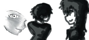
From these sketches, I had doodled these angles with a mouse in Adobe photo shop. I decided to play around with the program to understand how to use the tools that are included such as the pen tool, various brush sizes top use as well. You can see that the image isn’t completely tidy or well drawn, only because this was for me to try different ways of shading as well as sketching without a pencil. After trying the cell shading, I wanted to try and blend in the shading to the drawing on the left to see what happens when you smoothen out the cell shading.
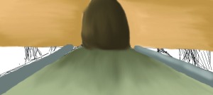
This was a first attempt of creating a background for my concept art for my story that I had still been currently developing in the earlier stages. I was completely new to painting with a digital program since I’ve had more experience with painting traditionally (using paper, paints and paintbrushes). I had used the smudge tool to blend in the colours altogether. For an unfinished piece I tried to do, I thought that the colouring wasn’t too terrible. I had used a tablet for creating the strokes.
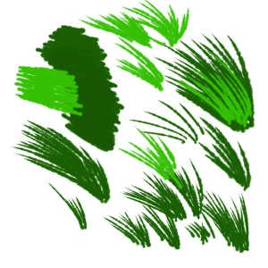
I wanted to test out and try to create a grass texture using different sizes and shades of green so that I would be able to create grass to possibly put in backgrounds. Changing the strokes made it easier to grasp the shape of the grass leaves for me, but I did needed help with understanding how to change and manipulate the brush tool to get the exact size and shape that I want. Although I would like to try more shades of other colours to blend together to make a realistic grass texture. I think that using a tablet was good for creating pen strokes that aren’t the same width all the way through. so this really helped with making the grass leaves.
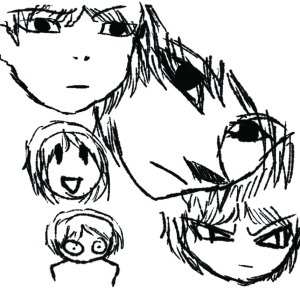
Being a fan of anime/manga (especially in my early teens), I had a tendency to imitate the art style. Even though I had enjoyed drawing in that art style, as the years went on, I wondered on how I would be able to try other art styles to widen my horizons. I was hesitant to do so in the past, but I knew that if I didn’t take this step, then how could I learn and develop as an artist? This was made digitally with the bamboo tablet and doodled all these faces and explored the different proportions I had used and tweaked to look at how angle and proportion can change the appearance of a drawing dramatically or just subtle.
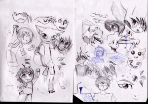
These are similar to my pencil doodles with the exception of using a Biro pen which I find much more comfortable to use rather than a pencil mainly for the faint strokes it gives in comparison to a Biro. Like the pencil doodles I had done, I had explored methods of shading that I had learnt through the beginning of the course as well as methods that I’m familiar with (cell shading and cross-hatching). When I had sketched these out of thin air, I remembered looking through different shading techniques that our Tutor showed us. I typically shade in my drawings, doodle or sketch, because I always like to give depth to my drawings. For me, the drawings seem so empty without any form of depth added to it. I often like to give my drawings a 3D look.
Speed paint Showcase
This speed paint was uploaded of the purpose of displaying my attempts of exploring around with Photoshop and the different techniques and colours that I had used to digitally colour in the sketch that I had started up imported onto the software. Of course, I used a tablet to draw and paint the sketch. I thought that it would be more difficult to use the mouse for outlining the drawing or just colouring in neatly. I had been indecisive on how I wanted to edit the picture in Photoshop, from the fact that I had been messing around. From the beginning I was outlining and creating strokes for the hair. I didn’t spend a lot of time colouring in the skin and background and if I were to do this again, I would have tried to manage my time better so that the final outcome would have been better. I had spent hours trying to figure out the why the first part kept giving monochrome colour (I was unaware of the colour mode settings) until my Support Worker and Tutor helped me to tweak those settings co that I could
